Point of Care: Telehealth + Critical Care
In Two Places at Once
🗓 Posted August 6, 2021 by Carol O. Rogers, Indiana Business Research Center (IBRC) Co-director
Tele-healthcare exploded onto our screens in 2020, with an estimated 154% increase (see CDC 2020 study) in March 2020 compared to 2019. The benefits seem relatively obvious during a pandemic when interpersonal contact restrictions were advised. It expanded access to care, reduced disease exposure and likely significantly reduced demand on facilities. According to the American Hospital Association, 76% of U.S. hospitals connect patients with practitioners through video technology. And a McKinsey report released in July estimates that telehealth has reach a stable level that is 38% higher than pre-pandemic use. Investments are similarly set to break records, with a 30% increase in venture capital plowed into digital health (2020 vs. 2017 figures).
Understanding where the providers of health care are located can be an important factor when envisioning how, where, and when critical care will emanate (the focus of NETCCN), as well as simultaneously considering patient location.
As David Wild has described the use of technology to provide distance-based critical care: “disasters [or urgent need] don’t wait for our technologies to mature.” But we do have a mature health system across the United States that, in terms of physical availability of care (through beds and ICU beds), was thought to be sufficient – until the pandemic hit and local hospitals were hit with recurring waves of patients.
We wanted to see where the capabilities for tele-critical care already existed among the hospitals nationwide. We referenced a database of tele-critical care hospitals provided to us by Dr. Ben Scott, a Critical Care Anesthesiologist at University of Colorado Hospital and member of the Society of Critical Care Medicine (SCCM). The Tele-Critical Care (TCC) Hospital Database is available to registered users of the Total Performance System (TPS).
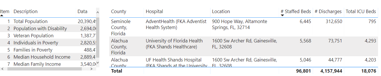
As part of the work for the TiDE Learning Accelerator project, it seemed appropriate to nail down the where and what through a visualization that could not only provide a sense of location, but also provide details on the individual hospitals and the local community in which they exist. The screenshot below shows the number of hospitals in Florida with telehealth capabilities.
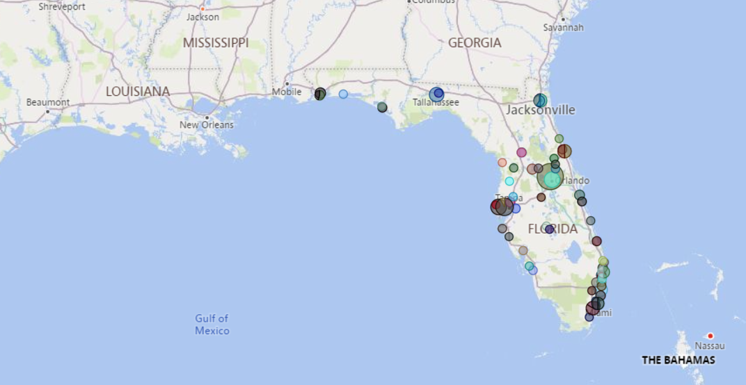
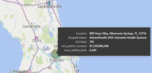
Zooming in allows us to click on a circle (each circle represents a specific hospital and the size of the circle indicates how large or small the hospital is in terms of beds and revenue). A viewer can get a quick summary of not only the hospital but also the community (county) in which it is located.
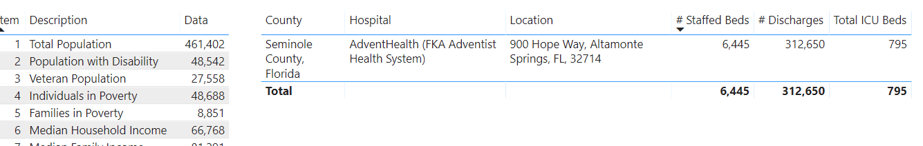
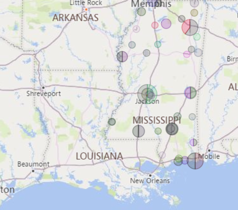
The power of interactive visualizations is the ability to answer multiple questions quickly that come to mind as one scans and sorts and filters. For example, by selecting a state such as Mississippi, we can see the total number of beds, ICU beds, and discharges.
We are making the Tele-Critical Care Hospital Map visualization available within the Best Practices and Learning Platform to encourage NETCCN participants and stakeholders to provide feedback on the types of “situational awareness” visualizations they would like us to provide and the sort of information that may be most useful as we move forward. Our next iteration will be to visualize the counties of residence of patients and the location of the hospitals at which they receive tele-critical care.