Data Storytelling
Edited April 24, 2021 by Jack Murakami and Fauzan Isnaini and Andra Ferrara
Data-driven storytelling uses data and related visualizations to convey meaning in a compelling way
Data Storytelling
Data-driven storytelling is the art of constructing a narrative with regards to a set of data and its related visualizations: the purpose is to convey the meaning of that data in a compelling delivery.
Why?
- Only 5% of people remember the numbers/statistics, while 63% remember the story;
- Stories persuade twice as much compared to hard data [1].
The stories can be delivered in almost any conceivable way, but the opportunities are abundant for interactive web pages, animated visualizations, In person presentations and talks, slide decks and dashboards. In each case the delivery may be slightly different, but the purpose is the same: to get the audience to care about the data you are presenting!
Have you ever been to a movie where maybe the main character dies at the end or there is some other major plot point, and you leave the theatre thinking what a bad movie it is? It was probably because the film makers did not do enough to make you care about the character. Audiences remember compelling narratives. So the next time you have to do a presentation, the challenge becomes to make that material relatable, so that the audience cares about the data.
A good storytelling framework will some variations, but should include 4 basic points. The ones shown are modeled on the classic story telling framework of German author Gustav Freytag, with the main different being instead of a denouement, we conclude with a call to action. Remember that this is not a formula. The idea is simply to get your audience engaged with the material.
- Introduction/Attention grabber
- Rising Action/Pose problem
- Climax/Offer Solution and describe benefits
- Next Steps/Call to action
![Freytag's Pyramid Freytag’s Pyramid [citation #2]](/projects/dsla/images/data_storytelling_1.jpg)
Visuals
There are some basics to keep in mind when formulating visualizations for your data stories. These are not hard and fast rules, but definitely something to keep in mind when preparing your data storytelling.
Pie Charts are hard to read: as it turns out the human eyes and brain don’t process area very well. Our brains are much better at processing visual length. So perhaps use bars when comparing data rather than pies.
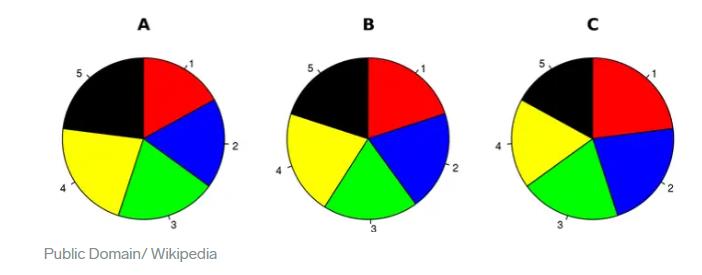
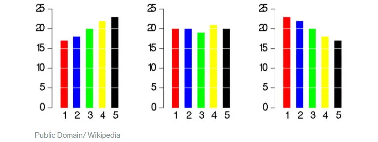
See how much easier it is to see which piece of data is the largest and smallest, for instance? It is almost impossible with the pies and easy and almost instantaneous with bars.
Preattentive Processing: Look at the box below and count all the 5’s. It should take you a while to come up with the correct answer [3].

Now do the same exercise for the below visual.

See how quickly your brain is able to do the same thing? This is our brain’s ability to preprocess visuals so before we even have time to engage our thinking brain, our unthinking brain has already done the work for us! There are several preattentive attributes we can employ to help our audiences process easily and thusly, stay engaged with our data stories. This is an example of the preattentive attribute for color. The below figure shows all the attributes. Use them and keep them in mind when constructing visuals.
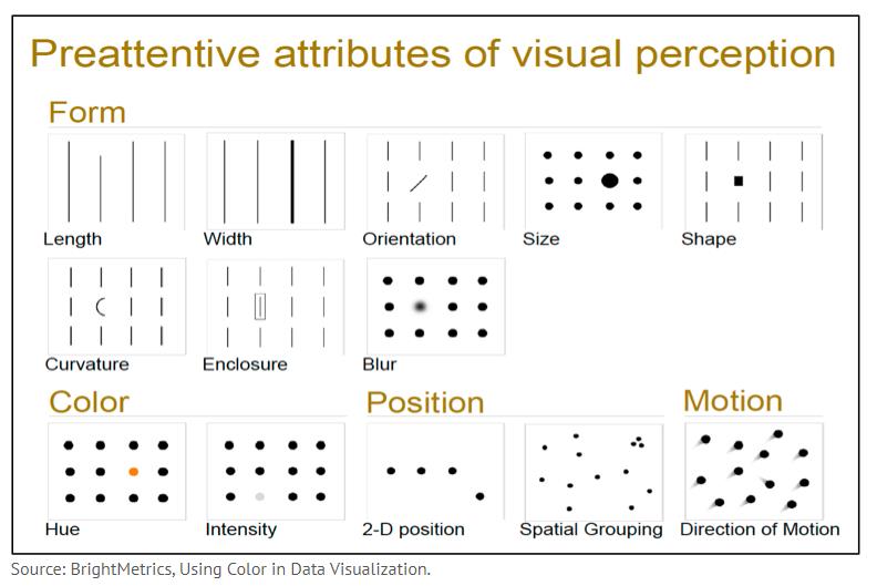
Be aware of the things that can draw attention to certain parts of your visuals and can move your story in intended direction.
Examples
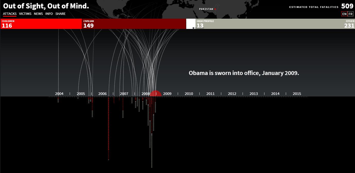
This is a powerful, interactive, and visually engaging data visualization narrative that show drone strike activity in Pakistan. What about this piece of data story telling makes it engaging? How does if following and/or break from Freytag’s story framework? Is there anything that could make it more effective? Think about this for all the other examples and look out for good storytelling elements in any other visual you come across in day to day life.
http://drones.pitchinteractive.com/
The NY Times is a great source for creative and visually engaging data visualizations. The below is another example of data storytelling.
https://www.nytimes.com/interactive/2020/world/coronavirus-maps.html
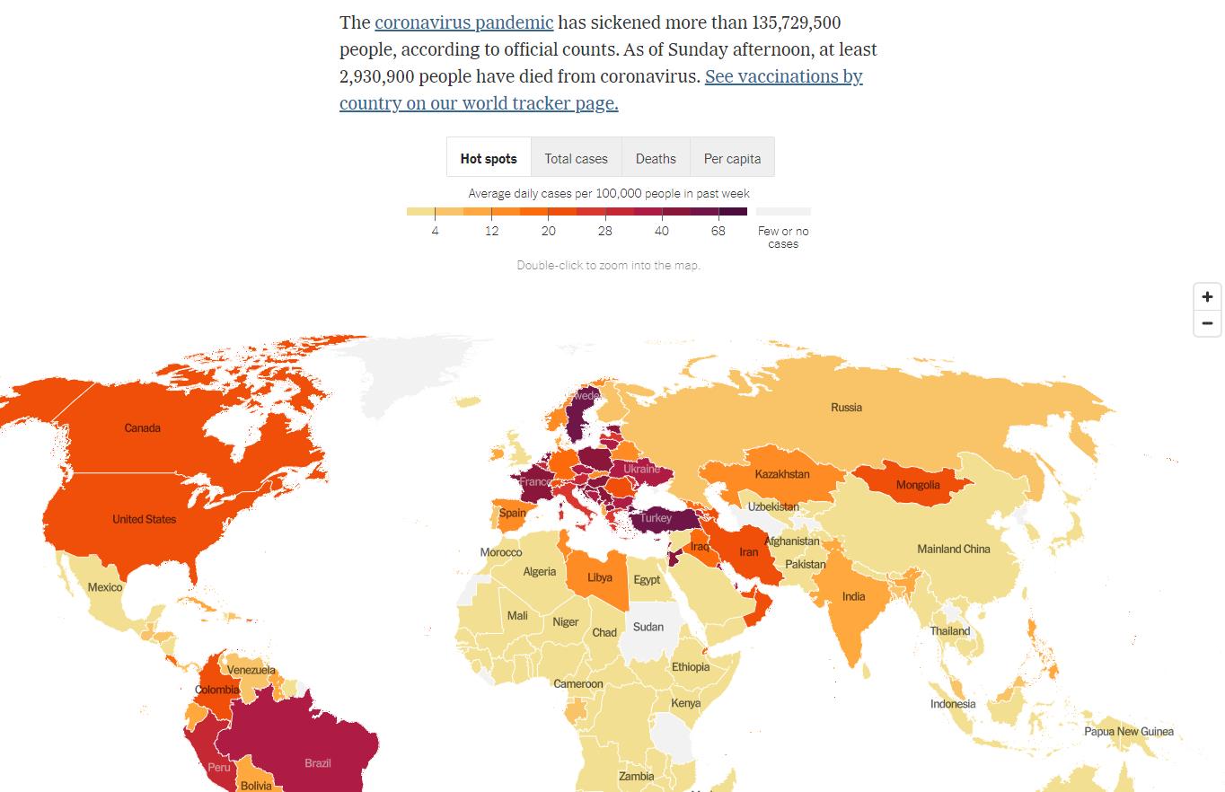
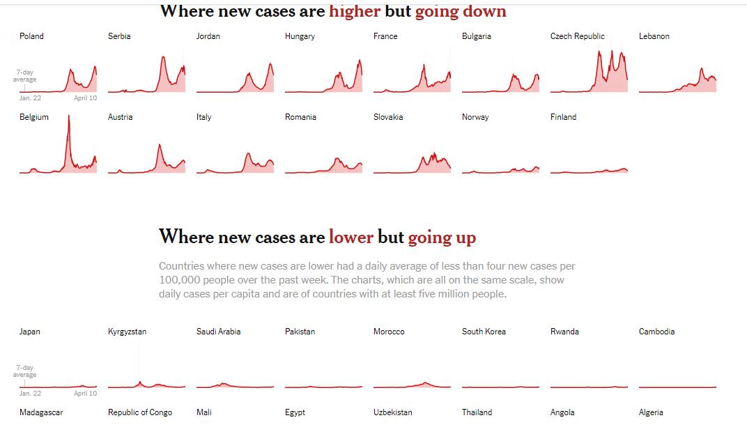
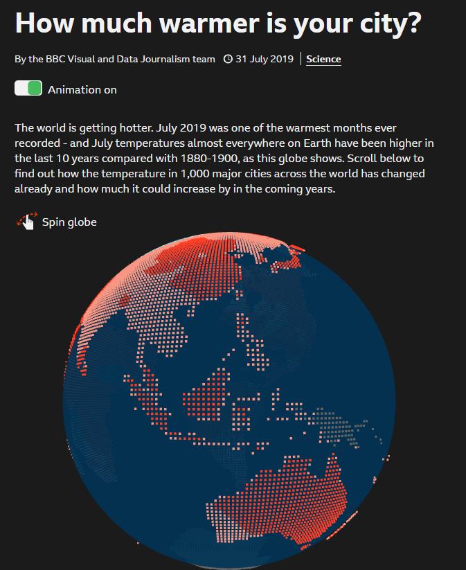
The below is a simpler, but effective storytelling page heavy with data visualizations and interactivity. Click on the globe and make it spin!
https://www.bbc.co.uk/news/resources/idt-985b9374-596e-4ae6-aa04-7fbcae4cb7ee
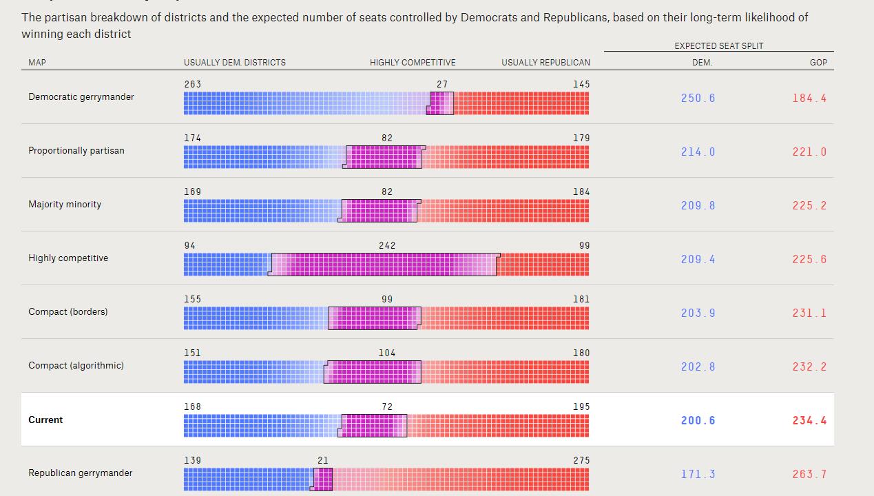
Finally another example. Highly interactive, but also requires a little more investment from the reader/user.
https://projects.fivethirtyeight.com/redistricting-maps/
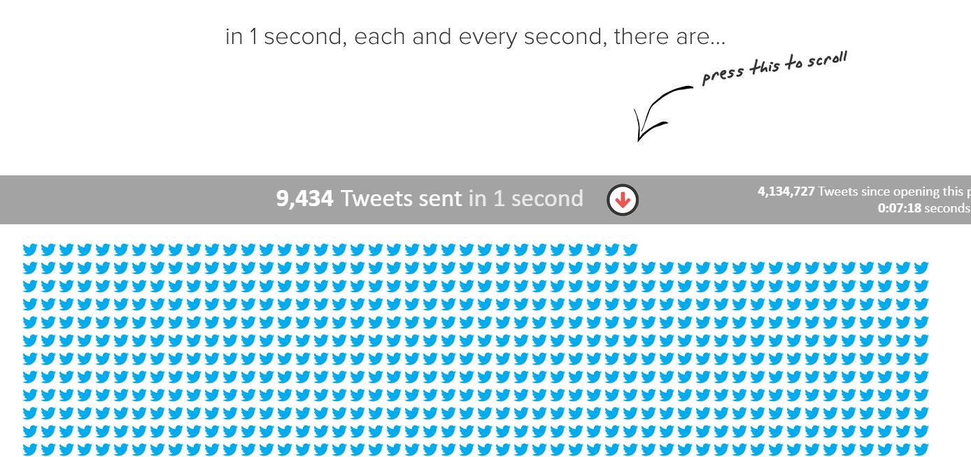
https://www.internetlivestats.com/one-second/
If you’re interested in making data stories and visualizations that make an impact, I highly recommend you go through the following information.
Resources
Storytelling with Data | Cole Nussbaumer Knaflic | Talks at Google https://www.youtube.com/watch?v=8EMW7io4rSI
Turning Bad Charts into Compelling Data Stories | Dominic Bohan | TEDxYouth@Singapore https://www.youtube.com/watch?v=edAf1jx1wh8
Data Storytelling: The Ultimate Data Science Skill you Should be Working on by Sonia Motwani https://in.springboard.com/blog/data-storytelling/
How to Do Storytelling with Data Using Visualizations by Gintaras Baltusevicius https://whatagraph.com/blog/articles/data-using-visualizations
MAKING IT STICK: TELL STORIES https://mannerofspeaking.org/2009/10/13/making-it-stick-tell-stories/
Data Storytelling: Separating Fiction From Facts by Brent Dykes https://www.forbes.com/sites/brentdykes/2016/07/13/data-storytelling-separating-fiction-from-facts-2/?sh=4af0cc273a7c
The Art of Storytelling in Analytics and Data Science | How to Create Data Stories? By Shantanu Kumar https://www.analyticsvidhya.com/blog/2020/05/art-storytelling-analytics-data-science/
The Value of Mastering Data Visualization & Storytelling for Data Scientists by Ronald Van Loon https://www.simplilearn.com/value-of-mastering-data-visualization-storytelling-for-data-scientists-article/amp
What is Data Storytelling? https://toucantoco.com/blog/en/what-is-data-storytelling/
How to create a poet / writer using Deep Learning (Text Generation using Python)? By Pranjal Srivastava https://www.analyticsvidhya.com/blog/2018/03/text-generation-using-python-nlp/
Storytelling in Dashboards https://www.susielu.com/data-viz/storytelling-in-dashboards
Pre-attentive Processing http://www.datajourneyman.com/2016/03/21/preattentive-processing.html
More Examples of Data Storytelling
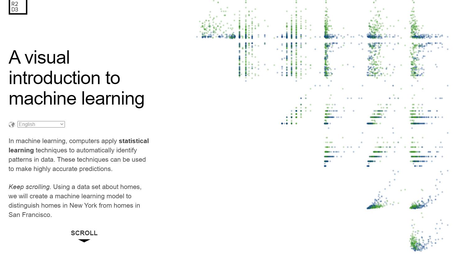
A Visual Introduction to Machine Learning
http://www.r2d3.us/visual-intro-to-machine-learning-part-1/
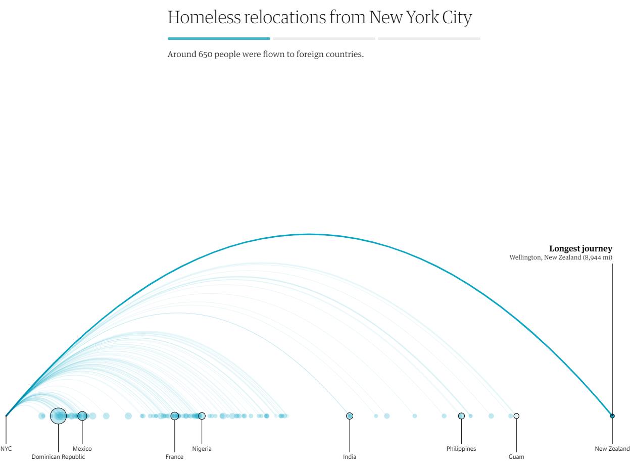
Bussed Out
https://www.theguardian.com/us-news/ng-interactive/2017/dec/20/bussed-out-america-moves-homeless-people-country-study
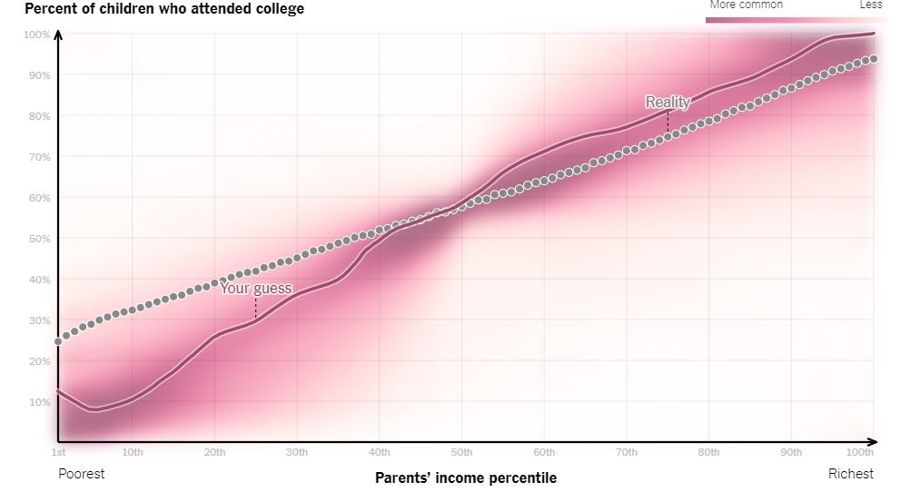
You Draw It: How Family Income Predicts Children’s College Chances
https://www.nytimes.com/interactive/2015/05/28/upshot/you-draw-it-how-family-income-affects-childrens-college-chances.html
References
MAKING IT STICK: TELL STORIES https://mannerofspeaking.org/2009/10/13/making-it-stick-tell-stories/
https://www.forbes.com/sites/brentdykes/2016/07/13/data-storytelling-separating-fiction-from-facts-2/?sh=15bb3b0a3a7c